DURATION: June 2021 - Present
COLLABORATOR: Karan Singh
This past summer I interned at WorkBoard,
an enterprise SaaS company delivering Objectives & Key Results (OKR)
software and expertise. As a software engineering intern on the Accessibility team,
I worked on remediating the WorkBoard help center to make it more accessible,
establishing WorkBoard’s design system on ZeroHeight, and developing an
emoji picker component from scratch using React for WorkBoard’s platform.
Methods
Wireframing
Prototyping
Accessibility Remediation
Tools
Figma
React
ZeroHeight
StoryBook
Github
Slack

Did you know that only 3% of the internet is accessible?
Or that statistically speaking, every person will experience
some form of a disability for at least 8 years in their life?
With the tech sector projected to hire 3x as many employees with
disabilities in the next five years, it’s more important than
ever to make software accessible to everyone. WorkBoard, a
market leader in OKR enterprise software, has made strides on
this front -- developing rigorous processes focused on making
the platform accessible. My internship has specifically allowed
me to become a part of this movement, enabling me to educate myself
on accessibility software engineering and providing me the opportunity
to help educate the rest of the company on the significance of digital inclusivity.
Zendesk Remediation
We began by spending our first week doing Accessibility training in preparation
for our first project working on making our Help Center articles on Zendesk more
screen reader accessible. Screen Readers rely on the use of semantically correct
HTML and descriptive links among many other best practices in order to make content
accessible, the WYSIWYG editor that Zendesk and many other applications use does not
take this into consideration. So we determined a
list of priority articles and then dove into the HTML associated with each article
to remediate. We looked for things like images with missing alt text, lists that
are not using the native list tag, added ARIA-labels, made the links descriptive,
and made changes to the UI to address color contrast issues.
ZeroHeight Design System
Zeroheight is a collaborative platform that allows companies to
prepare and maintain design system documentation for a component library.
A Design system is essential in digital product design and an ideal design
system consists of reusable components that follow clear style guidelines
and ZeroHeight is how we document the nuances of each component and these
style guidelines. I documented each of the most essential components in ZeroHeight, such that
each has their own page with a style guide showcasing the different states of the component, a
usage guide that goes through the do’s and don’t for the component as
well as its variants, sizing, color, and alignment standards, an
accessibility page that details how the component’s design and
intended implementation meet the essential accessibility standards,
and a live demo where you can interact with the component once it is
implemented in WorkBoard's component library. Having the design system organized
in this way helps build transparency in the design process,
especially regarding accessibility, and will also allow for
developers and quality assurance engineers to better understand the intended design of each component.
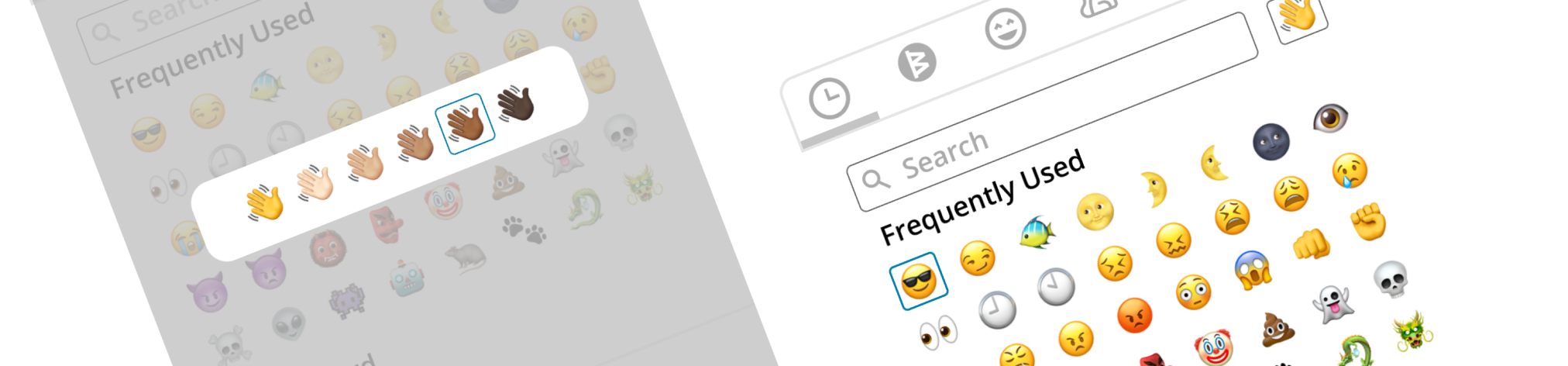
Emoji Picker
Finally, my intern partner and I working on an Emoji Picker component for the component library.
We began by looking at Open Source solutions and scoped out the necessary attributes
for an ideal emoji picker such as a skin tone picker for inclusivity and an emoji infobar for
accessibility. Since the Emoji Picker is a very complex compositional component,
we wanted to employ the ideologies behind atomic design, looking through the component
library to find the building blocks for the Emoji Picker component. So
throughout our iterative design process, we took these building blocks into
consideration, applying the existing design guidelines for the popper and
search component into our design for an ideal implementation. After meeting with the designers,
developers, and PMs to discuss the design and implementation details, we began designing
the picker on figma and created an interactive prototype as you can see below. We are
currently working on implementing this in React.